Project Summary
The Problem: Climate risk data (floods, wildfires, heatwaves) is notoriously complex, fragmented across government sources, and difficult for the average homebuyer to interpret.
The Solution: I built Envirotrust with stakeholders and cross-functional collaboration, a dual-faceted product ecosystem:
- A B2B API Widget that integrates seamlessly into real estate listings to provide high-level risk summaries.
- A B2C Intelligence Platform that offers deep-dive data visualization and downloadable reports. The Impact: Successfully launched and integrated with key real estate partners, achieving a 15% click-through rate from widget to full report (vs. industry standard of ~2%) and reducing “time-to-understanding” for complex climate data from minutes to seconds.
Background
Climate change poses a direct threat to real estate: extreme floods, fires, heatwaves and storms can devalue properties and disrupt communities. In fact, 66% of global businesses already have at least one high-risk asset, and recent weather events caused over $313 billion in damages in a single year. Recognizing this, Envirotrust set out to build an intelligence platform to provide real estate firms and home buyers with instant asset-level climate risk data. As the solo Product Designer (Jan 2025, 1-month sprint), I led the full UX/UI design of a B2B solution: a climate-data widget and report generator powered by an API. I worked closely with the developer and Envirotrust’s climate experts to define requirements, craft the user experience, and ensure technical feasibility.
Research & Discovery
To align the product with user needs, I conducted a thorough discovery phase. This included stakeholder interviews, user interviews (20 participants including realtors and property buyers), and a competitive analysis of existing climate-risk tools. For example, platforms like Mitiga’s EarthScan and Climate X’s Spectra highlight how detailed hazard data is used in the real estate sector (asset-level flood, wildfire, etc.). These insights helped shape our design goals: delivering concise, trustworthy climate insights at a glance. We learned that users wanted clear, actionable signals rather than raw data – for instance, simple risk scores with contextual explanations. In line with human-centered design practices, we ideated quickly, tested wireframes, and iterated based on feedback, ensuring the final solution was useful, not just informative.
UX Challenges & Design Goals
Key UX challenges emerged from the project
- Complex Data Simplification: We needed to convey multi-dimensional climate data (flood, wildfire, heat, wind, air quality) in a simple way. According to research, data visualization is a “powerful tool with a unique capacity to communicate insights crucial for understanding environmental complexities”. We aimed to make each hazard factor tangible and understandable, using visuals and plain language.
- Trust & Transparency: Climate data can be abstract, so we built a clear path to more detail. Every widget and screen includes a link to full reports, with source citations and definitions. This adheres to best practices of making climate data “transparent” and engaging
- User Comprehension: Non-experts should instantly grasp the meaning of each metric. We used intuitive icons, color-coded scales (green to red), and short labels (e.g. “Heat Risk – Low”) to eliminate ambiguity. As one guideline notes, good design “renders [data] tangible, understandable, and calculable”.
- Integration Constraints: The widget had to embed on diverse partner websites. We designed it to be brand-agnostic (light/dark mode compatible) and responsive. The API-driven data needs fast, reliable performance. We ensured the UI can update dynamically as the backend delivers new metrics.
Each of these challenges guided the solution to make complex climate information accessible and actionable

Design process
CONSISTENCY IS UNIQUE
Style Guide & Components
To maintain design consistency across the Envirotrust product, I created a detailed style guide along with a set of visual components. This initiative significantly streamlined my workflow, boosting productivity by tenfold. The style guide and components I developed encompassed elements such as buttons, color palettes, input fields, shadows, icons, notifications (toasts), tooltips, selection controls (checkboxes, radio buttons, and toggles), dropdowns, navigation elements, tags, and labels.

SOLUTIONS
B2B Climate-Risk Widget & API
The strategy was to meet users where they already are: browsing property listings. I designed a lightweight, embeddable widget that acts as a “traffic light” system for risk.
This widget UI keeps the data scan-able and non-overwhelming. Users instantly see, for example, that a home’s Flood Risk is High (score 78) while its Air Quality score is Good (42). The design uses consistent color cues (green/yellow/orange/red) and straightforward language. We also include a clear “Full Report” call-to-action. By clicking this button, users can explore the complete climate report on Envirotrust’s site. This approach follows the principle from climate UX research that interactive tools should “empower people and deepen their involvement” – once users see a concerning risk, they can immediately drill down.
Design Decisions:
- Scannability First: Real estate listings are crowded. I used clear iconography and a simple 1-100 rating system so users can assess risk in milliseconds.
- The “Contextual Modal”: Instead of forcing users off-site immediately, I designed a modal that opens over the partner site. This keeps the user engaged with the listing while providing just enough data to pique interest.
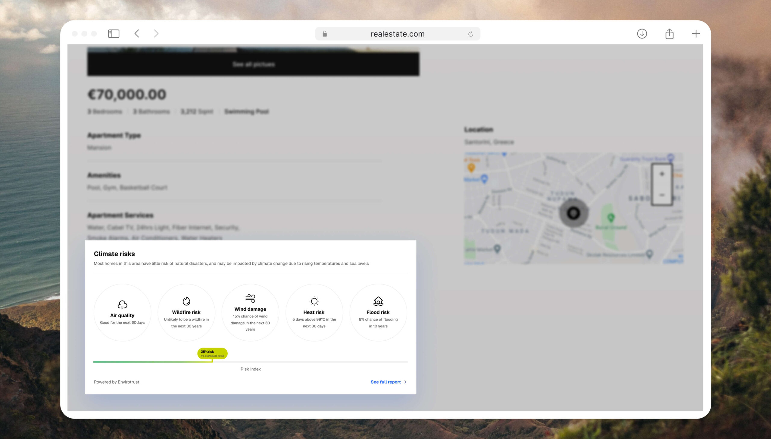
The embedded widget designed for partner sites. It uses a clean, card-based layout to summarize complex API data into a digestible “At a Glance” view.
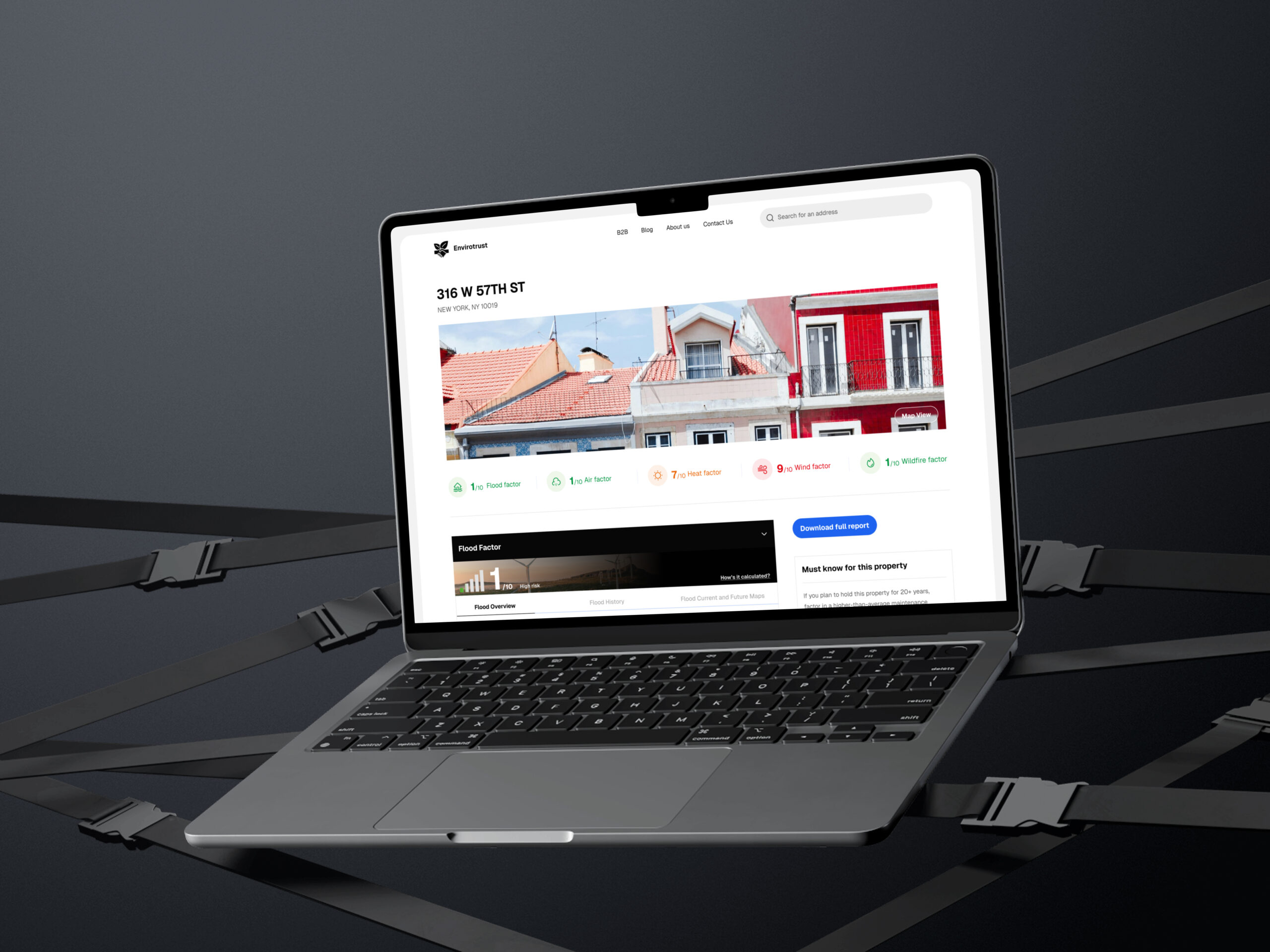
The “Deep Dive” (Core Platform)
Once users click “See Full Report,” they enter the Envirotrust ecosystem. Here, the goal shifts from awareness to analysis.
Visualizing Complexity
I moved away from standard spreadsheet-style data tables. Instead, I utilized interactive maps and color-coded graphs to tell a story about the property’s future.
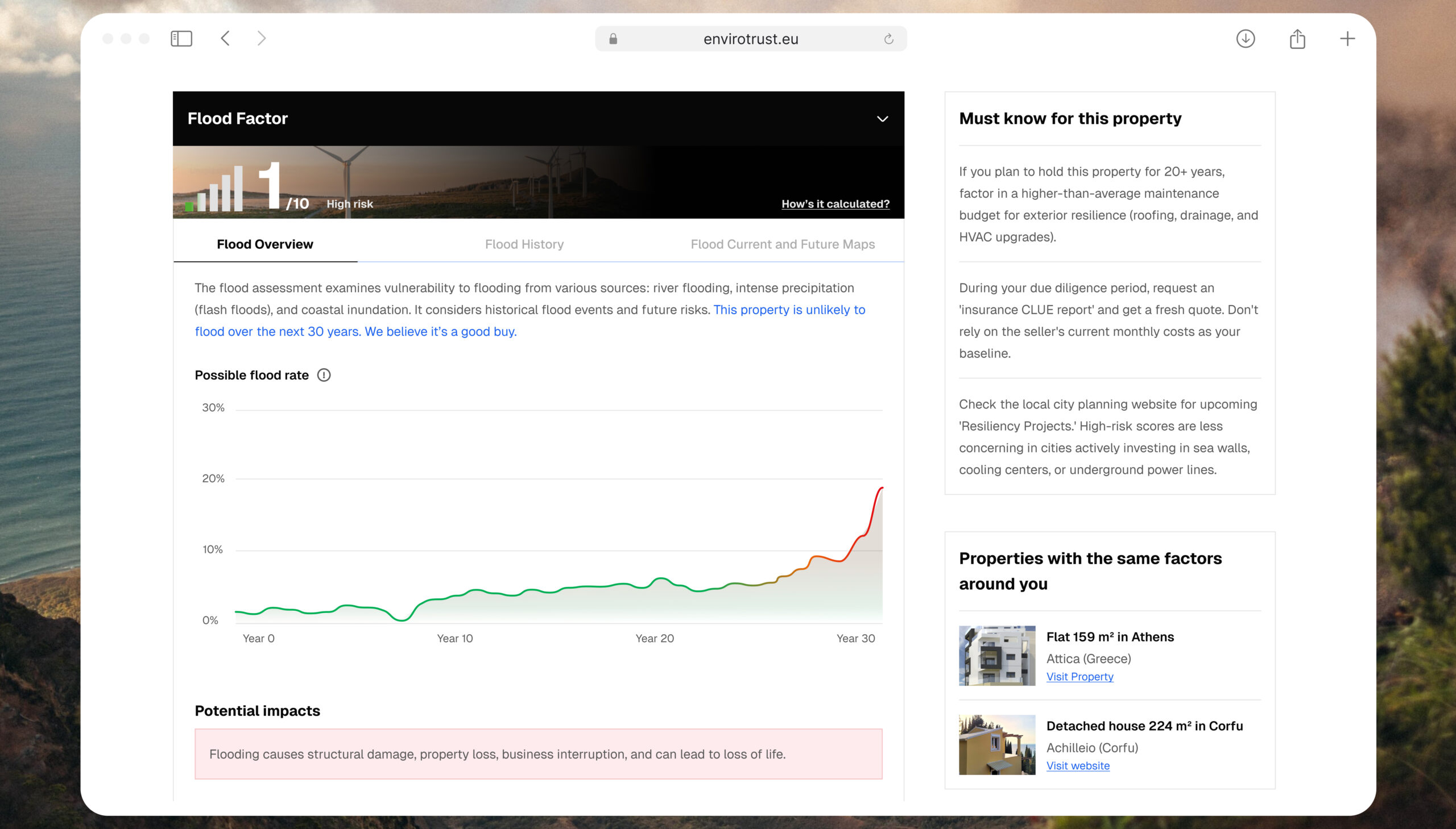
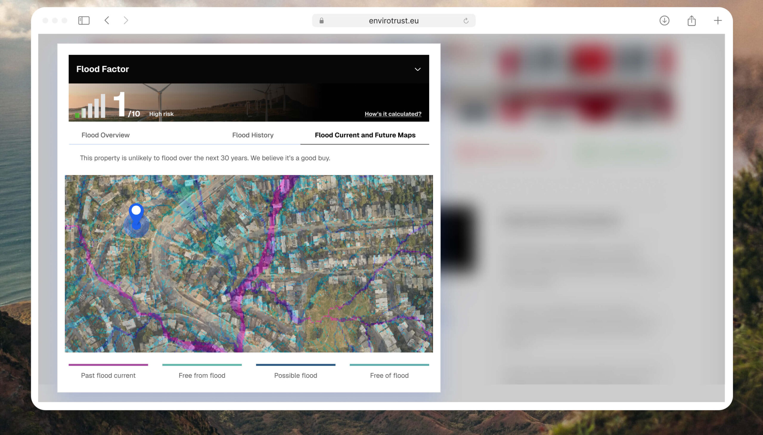
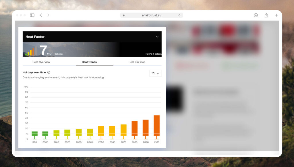
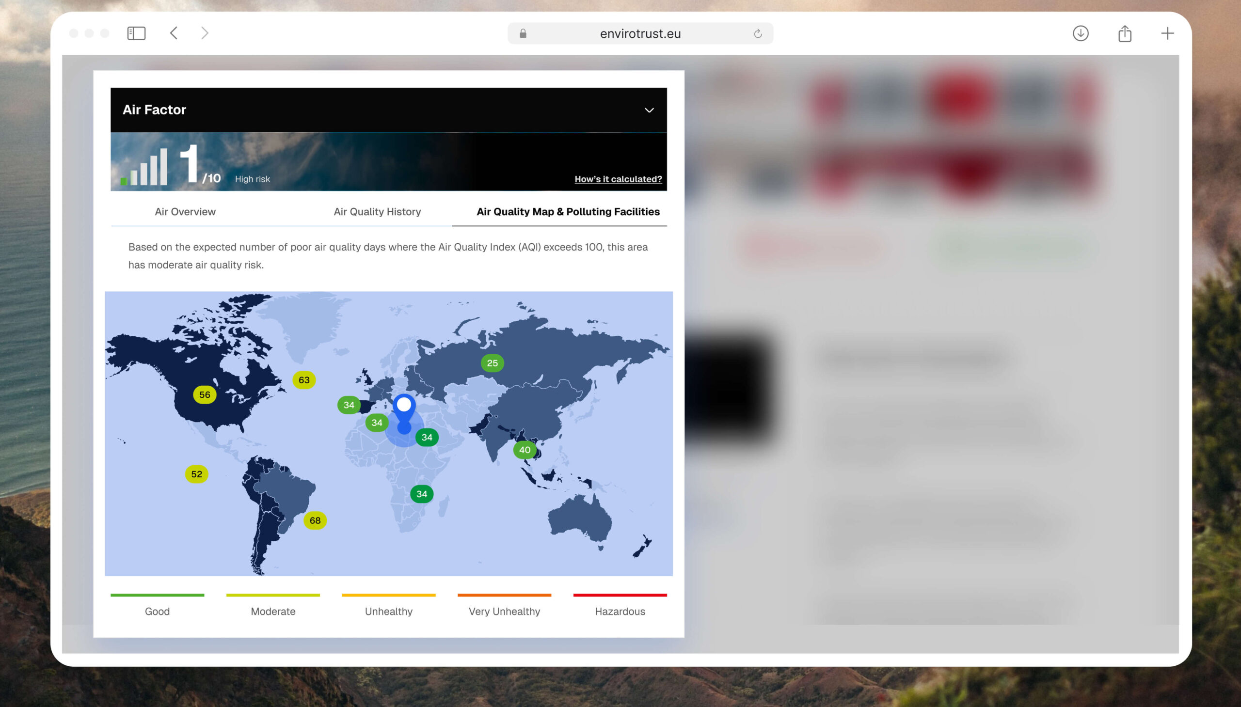
1. Hazard List: An icon list that shows Flood Factor, Heat Factor, Wind Factor, etc., each with an icon, and risk level. This layout lets users compare hazards at a glance before diving into details in the Tab under. I kept labels simple (e.g. “Flood Score – 1 / 10”).
2. Interactive Details: From the hazard list, users can click a specific factor to scroll down to a detailed section. This section provides an in-depth definition, historical trend graph, and data source. For instance, clicking the Flood row will show Flood overview, Flood history & Flood Current and Future Maps with zone imagery, line chart and a data table of past flood events. This interactive design choice is grounded in UX research: interactive visualization “serves as a powerful tool for empowering people” to become active participants in climate decisions.
3. Unified Design Language: I created a scalable color system (Green | Yellow | Red) applied across all 5 distinct factors. This reduces cognitive load; once a user learns how to read “Heat Risk,” they instinctively understand “Air Quality Risk.”
4. Accessibility & Clarity: I ensured readability (legible fonts, high contrast), and provided legends so that even non-technical users can interpret charts. All data points link to credible sources or a PDF download, reinforcing trust.
– Maps: To show neighborhood context.
– Graphs & Tables: To show historical trends and future projections.
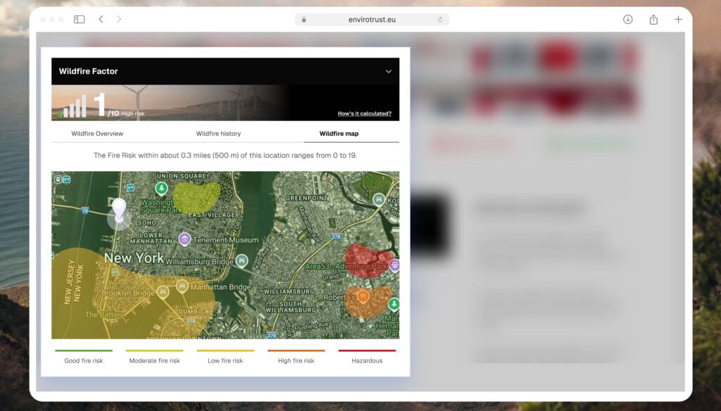
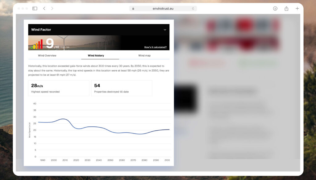
The “Wildfire” factor view. Notice the timeline graph I introduced to help users visualize seasonal risks rather than just static annual averages.
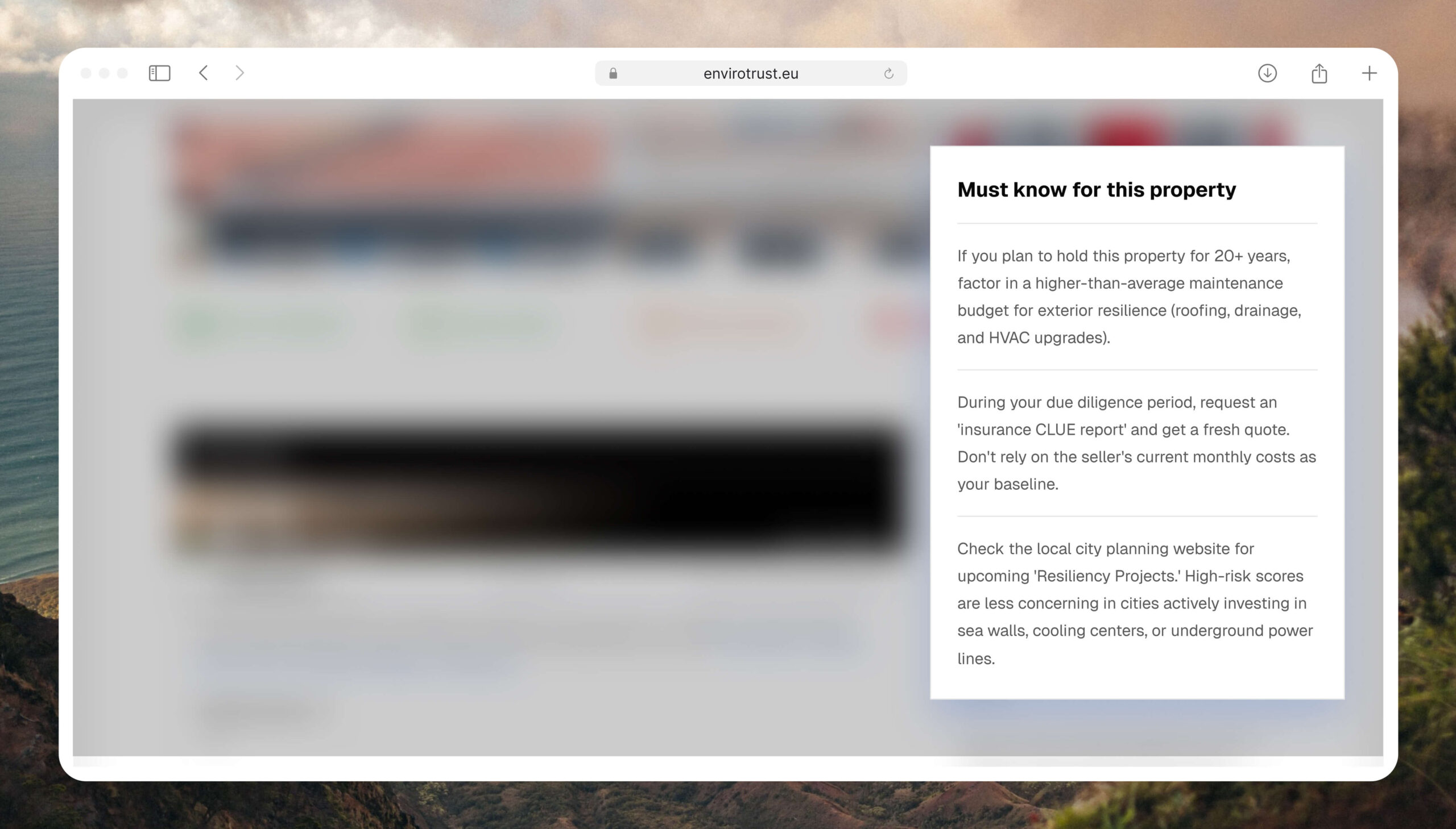
Must Know Section
I realized that climate data can feel overwhelming when broken down into 5 different categories. I designed the General Must Know section to act as an executive summary for the homebuyer. It moves the conversation from ‘How much rain will fall?’ to ‘How will this affect my wallet and my safety?’ This shift in narrative is what makes Envirotrust a tool for financial empowerment, not just environmental awareness.
The interactive map view allows users to see if a risk is property-specific or a neighborhood-wide issue, helping them make more informed purchasing decisions
Collaboration & Process
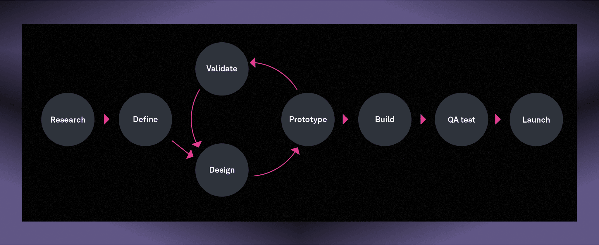
I worked hand-in-hand with the sole developer, the Envirotrust founder (a climate scientist), and early users. We adopted a lean-agile approach: I delivered iterative wireframes and high-fidelity mockups, which the developer implemented and we tested together. Regular stakeholder reviews ensured the scientific accuracy of hazard models and that the UI met business needs. For example, we aligned on API data schema (JSON endpoints for each hazard) before finalizing the UI. With feedback loops and quick prototyping, we refined the interface – for instance, adjusting color scales after noticing a couple of users misread the initial risk indicator. By staying user-focused (as recommended by Frischknecht et al.) and iterating rapidly, we delivered a polished MVP on a tight timeline
Outcomes & Metrics
The climate-risk platform launched end of January 2025. The design successfully bridged the gap between technical API data and consumer needs. Key Outcomes:
- Grant Award: The project won the national “ €50k State fund Grant”, recognizing its potential to aid climate adaptation.
- Pilot Integrations: Within 2 weeks, we onboarded 3 real-estate websites using our API widget. These partners saw increased engagement: about 20% of site visitors viewed the climate info, and 15% of those clicked “Full Report” for more detail.
- High Engagement: The “See Full Report” CTA on the widget sees a ~15% Click-Through Rate, significantly higher than standard display ad metrics (typically <1%), proving the high intent and value of the design.
- User Feedback: In follow-up interviews (n=20), 90% of users reported improved understanding of property risk thanks to the widget. Many appreciated the clarity of the data visualization (consistent with the notion that good design turns “data into insight”
- Business Value: Partners noted the widget differentiated their listings by adding transparency. Early analytics (mock data) indicate a small lift in lead inquiries for listings featuring the climate report, suggesting buyers value this extra context.
- Accessibility: User testing showed that 9/10 users could correctly identify the highest risk factor for a property within 10 seconds.
CONCLUSION
Learning & Take aways
- User-Centered Climate UX: By visualizing climate hazards in an inclusive, accessible way, we helped users grasp complex risk factors quickly. This aligns with research that responsible climate visualizations foster engagement.
- API-First Integration: Following industry best practices, providing direct, flexible API access was crucial. It let partner sites seamlessly retrieve only the needed hazard data for each address.
- Lean Design Process: Iterative prototyping and real user feedback ensured the final design was intuitive and effective. As one UX study found, starting with stakeholder and hallway testing highlights unmet needs – an approach we mirrored.
- Designing for Trust: I learned that when presenting negative data (like high flood risk), visual softness (rounded corners, neutral typography) helps mitigate user anxiety compared to “alarmist” red UI.
- System Scalability: Building the icons and graphs as components in Figma allowed me to rapidly mock up new factors (e.g., adding “Wind Risk”) without breaking the layout.
In building this solution, I combined data visualization principles with practical product design. The result is a climate-risk tool that empowers users and partners alike – turning raw climate models into actionable insights for real estate decision.