DISCOVERY & RESEARCH
Overview
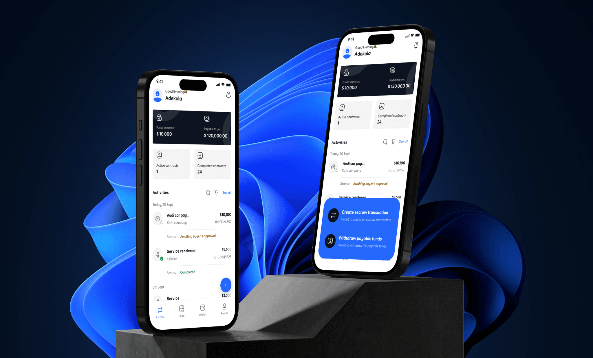
No wayo is a cutting edge escrow – ecommerce-finance mobile & web solution with the goal of empowering its users with the tool to initiate and conduct safer transactions which help them mitigate risks by being a sort of money safekeeper or you can call it the Raymond Reddington of the FBI and the Criminal world.
Additionally, No wayo offers an in-app marketplace helping it’s users to buy & sell their products without fear of being defrauded or running into a scandalous transaction.
Understanding the problem
In a landscape where transactions (Large or small) often involve parties unfamiliar with each other, users face significant trust issues that led to stalled negotiations and increased the risk of financial losses. The lack of a secure, neutral third-party solution made it difficult to finalize deals with confidence.
Solution Induced
I implemented a tailored escrow service that provided a secure, neutral platform for transactions, ensuring both parties’ funds were held safely until all conditions were met. This solution restored trust between buyers and sellers, leading to quicker deal closures and significantly reducing the risk of financial disputes.

Product goals
- Enhance Transaction Security and Trust
- Streamline and Automate Transaction Processes
- Offer Flexible, Customizable Escrow Solutions
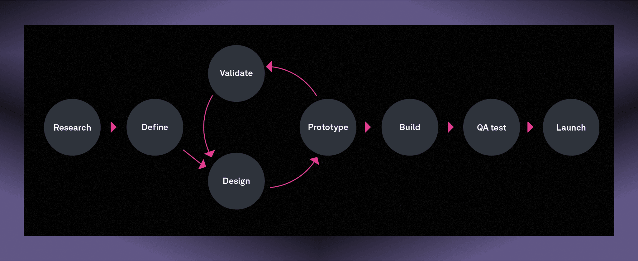
Design process
Research time
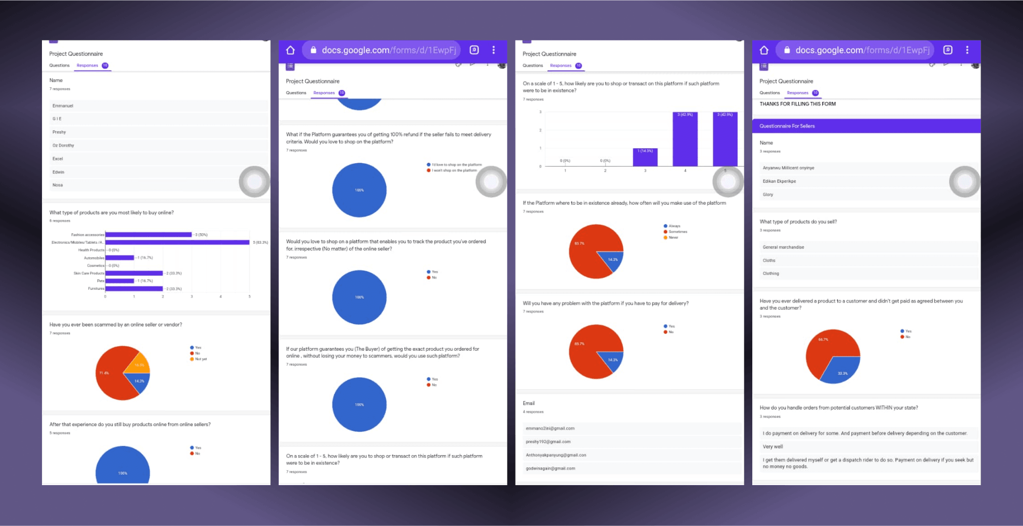
The UX phase began with getting to know the users (demography , target market, competitors and the market) and their behaviours and the research goal was aimed at getting a clear idea of the problem as it directly affects the users (parties involved in transactions), and uncovering their needs and frustrations to better understand how to create a better experience for them. Research started with interviews and one-on-ones to get some qualitative data and also surveys was taken to gather quantitative data to give more indepth insight to create a product that works.
Brainstorming sessions with the design team were another key aspect of the research process. These collaborative discussions allowed us to generate innovative ideas for features and user flows that would address the needs identified during user interviews. We explored various design concepts, such as visualizing energy usage in a user-friendly way and providing tips for reducing consumption.
User Persona
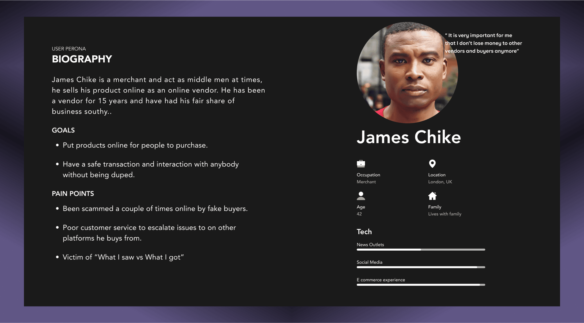
To create a user-centered product that effectively meets the needs and addresses the pain points of Buyers, sellers and merchants, I developed three (3) user personas to represent each user type.
Insights
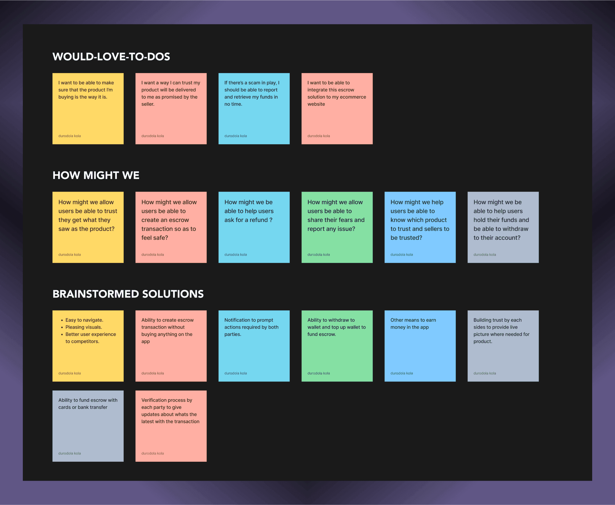
Following the quantitative and qualitative research conducted, which includes merchants, sellers, ecommerce solutions, buyers and some brainstorming and assessing existing solutions. As a result, we created this insight board based on those data. It helped us get a better understanding of the users, what they would love to do, how might we help them and brainstorm solutions to build a product that solves their problem (s).
Competitor’s Analysis
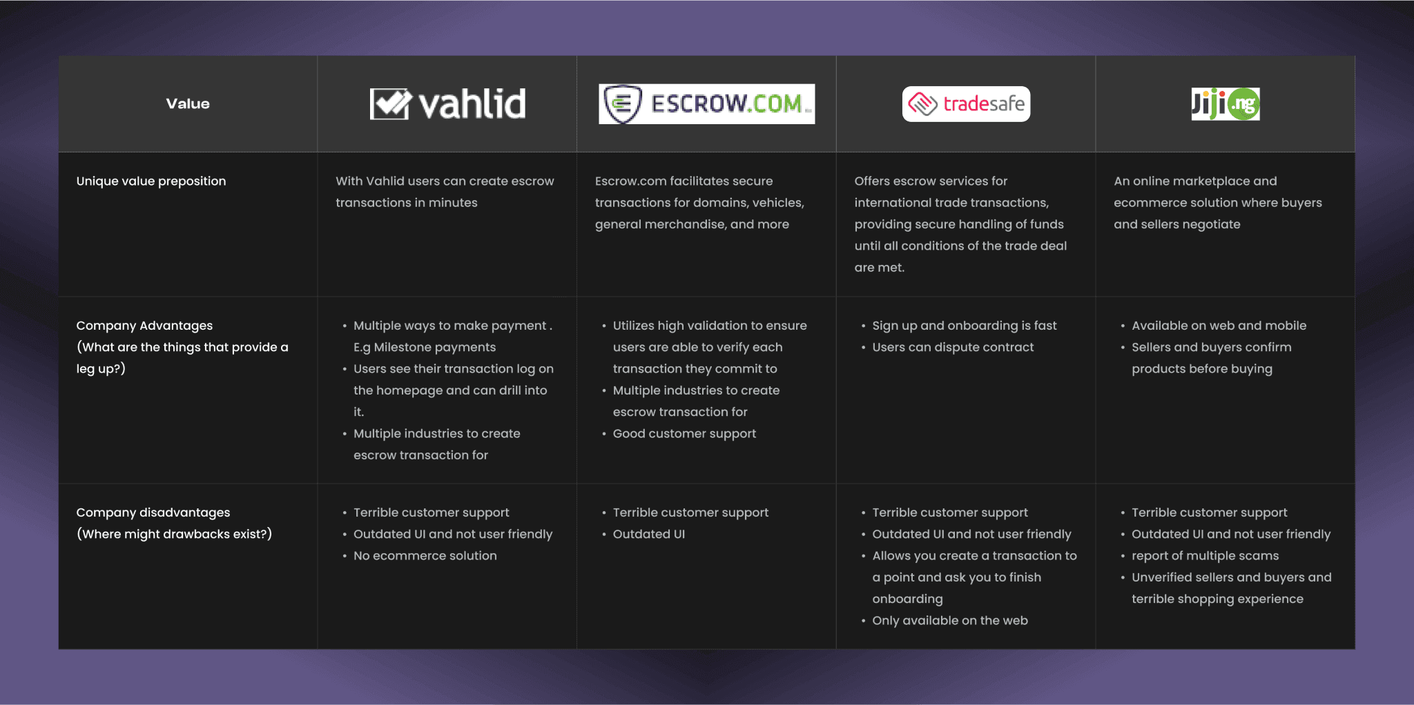
The competitor analysis was aimed at providing strategic insights into the features, functions, flows, and feelings evoked by the solutions of the competitors.
STRUCTURE
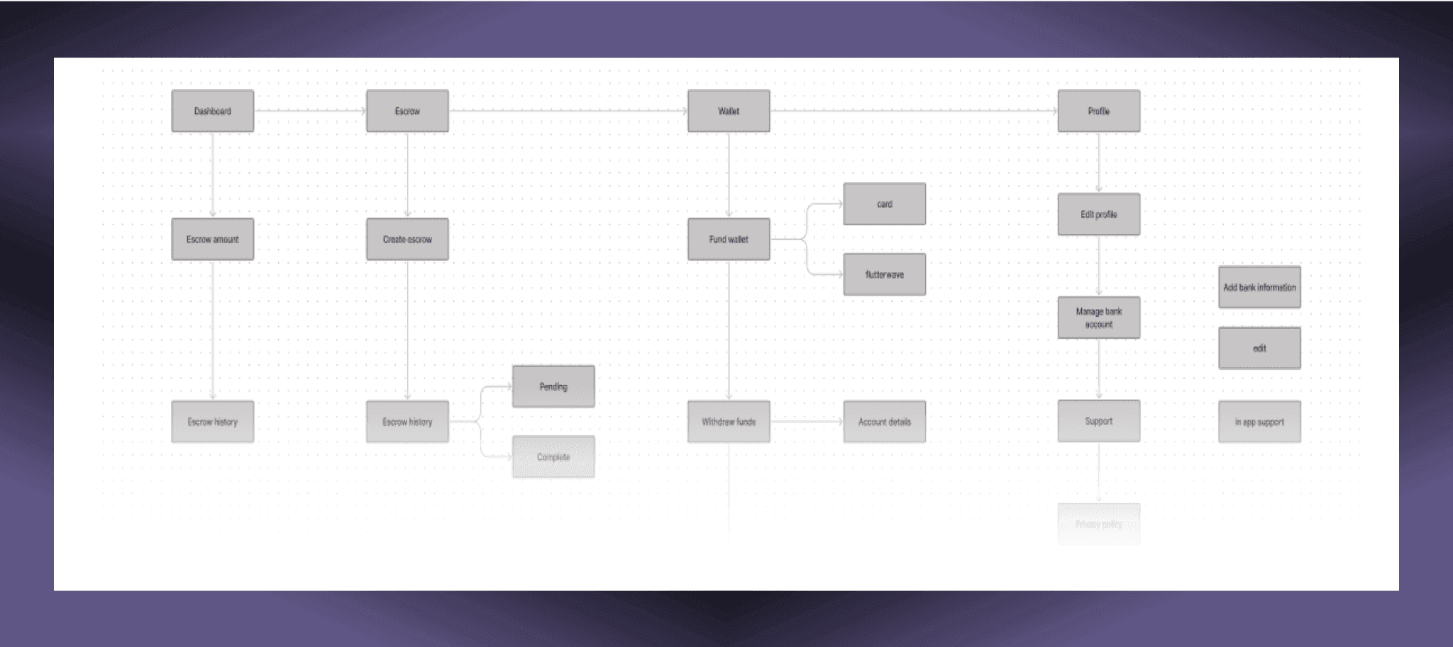
User flow
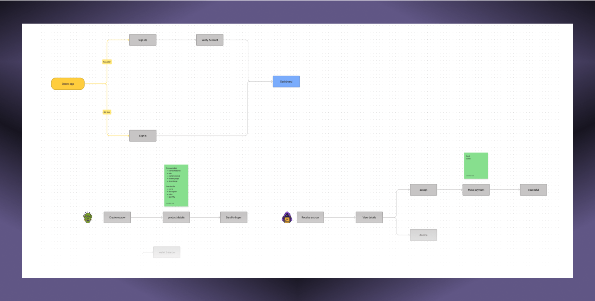
Gathered information on the goal by using the user persona, understanding the user’s role, typical activities, and wants.Using this information, I was able to analyze the tasks and flow users need to complete getting an escrow done.
Information architecture
Given the scope of this product, it was essential to ensure users could find their desired content quickly. To achieve this, I utilized the card sorting method to understand how users would naturally group items during the sorting process, allowing me to create an effective information architecture.
Skethes & Wireframe
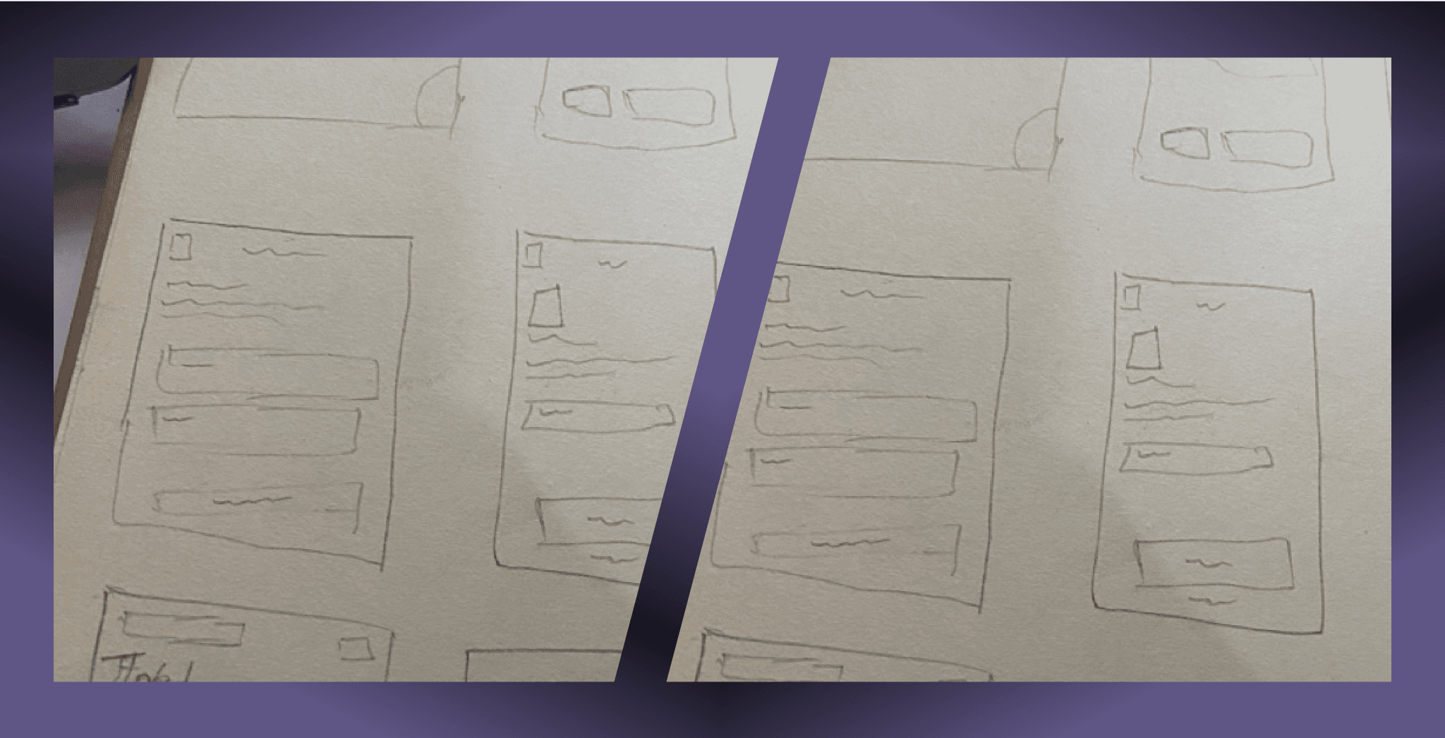
After completing the finished designing the user flow, I make sketches on the app interface on paper, creating a first-hand view of the ideas I had in mind for what the UI may look like later in the future.
CONSISTENCY IS UNIQUE
Style Guide & Components
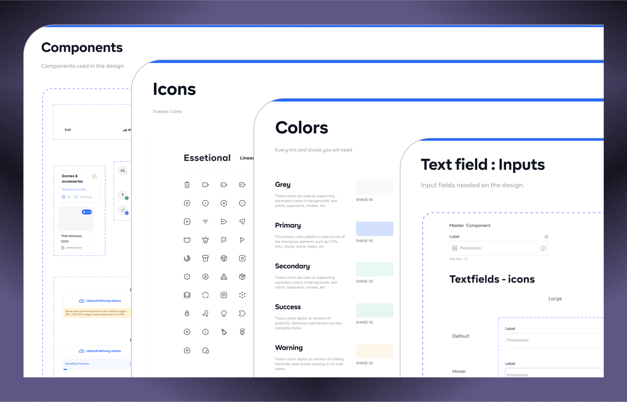
To ensure a consistent design throughout the No Wayo product, I developed a comprehensive style guide along with various visual components. This approach streamlined my workflow and enhanced my productivity by 10X.
The style guide and components I created included elements such as buttons, color schemes, input fields, shadow effects, icons, notifications (toasts), tooltips, selection controls (checkboxes, radio buttons, and toggles), dropdown menus, navigation elements, tags, and labels.
EXPERIENCE THE PRODUCT
Escrow dashboard
To ensure a consistent design throughout the No Wayo product, I developed a comprehensive style guide along with various visual components. This approach streamlined my workflow and enhanced my productivity by 10X.
The style guide and components I created included elements such as buttons, color schemes, input fields, shadow effects, icons, notifications (toasts), tooltips, selection controls (checkboxes, radio buttons, and toggles), dropdown menus, navigation elements, tags, and labels.

Escrow transaction details
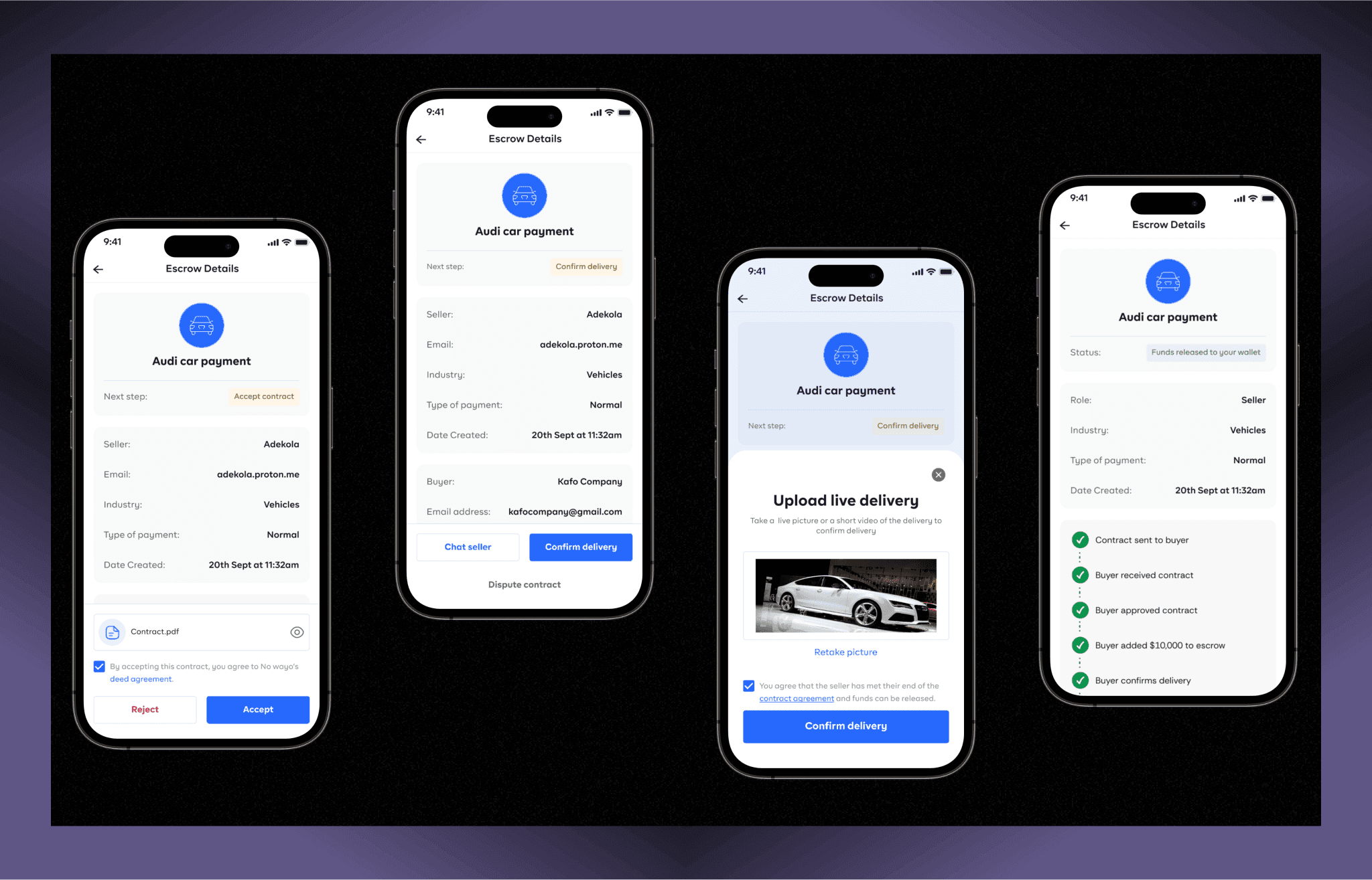
The escrow details screen presents a concise overview of a transaction between two parties The screen provides key transaction details, including the industry involved (vehicles) and the payment type. It also outlines the next step for both the buyer and seller (the parties) which is located at the header so the user knows what the next line of action should be. It also ensures both parties understand the contract and sign before the transaction starts. The second screen further elaborates on the delivery confirmation process by prompting the buyer to upload a live picture or short video of the delivery. This step ensures that the seller has fulfilled their contractual obligations before the funds are released. The buyer can review the evidence and choose to retake the picture if necessary. Once satisfied, the buyer can confirm the delivery, thereby authorizing the release of funds.
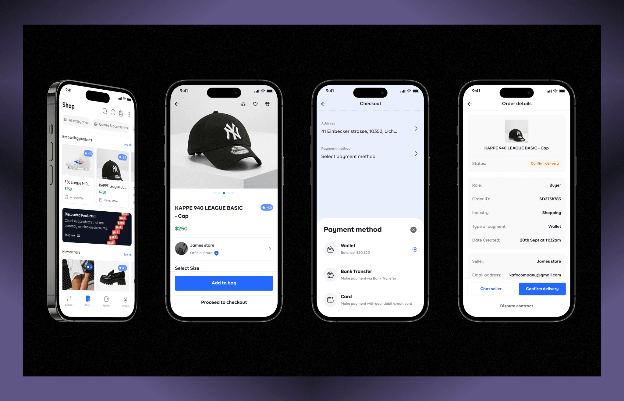
Shop
The No wayo strore front is built to allow users be able to perform the e-commerce transaction and be able to pay in whatever method they would love to. Also strategically placed some promotional banners to not capturing the user’s attention but to also help in boosting conversions and driving revenue for No wayo.
I also tried tapping into user’s pre-existing mental models by introducing the “category section” on the homepage. I had to mimic the physical stores so users can process information efficiently and reduce decision-making cognitive load.
Wallet
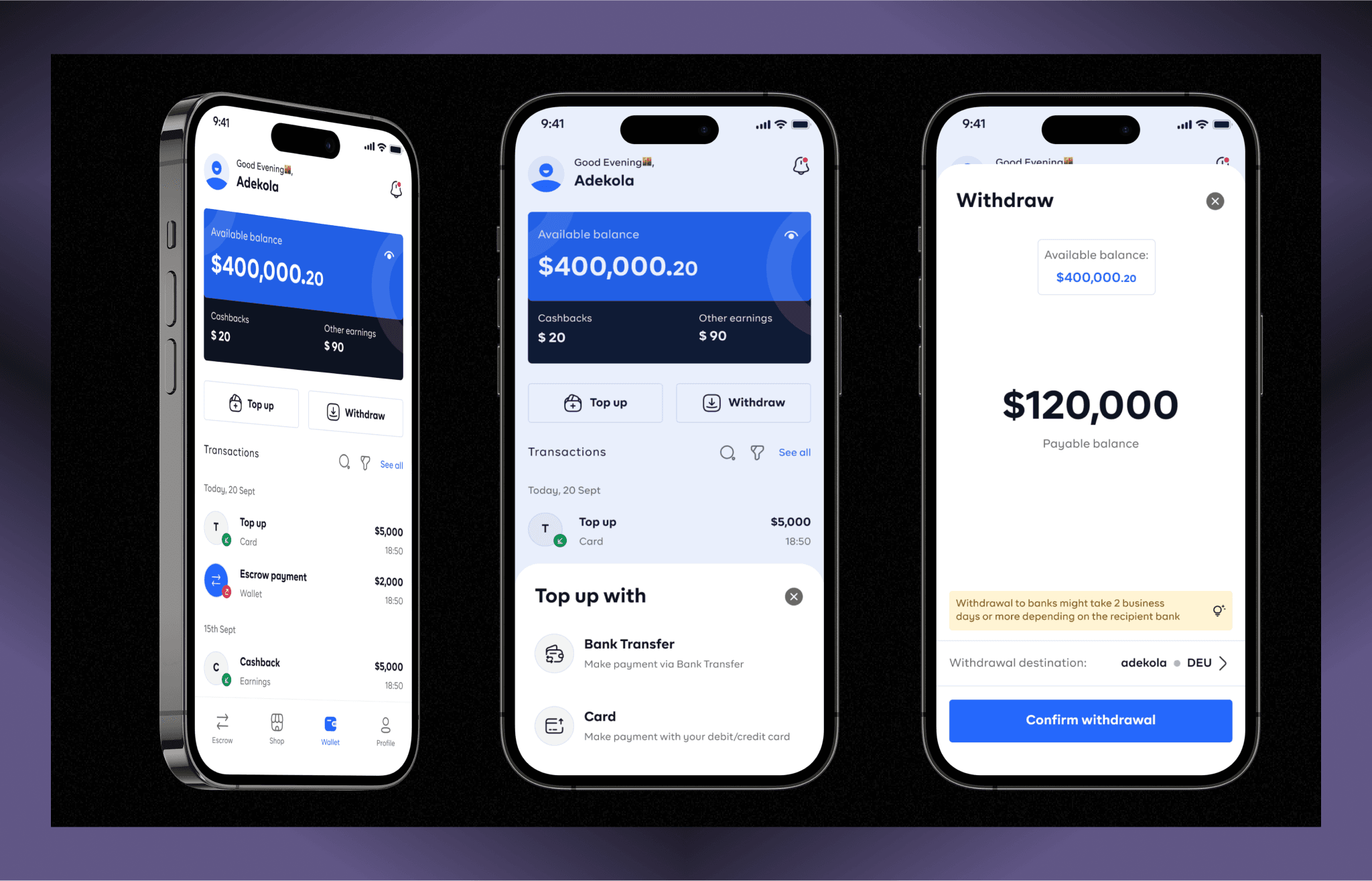
The wallet page was designed to help pay for all their transactions (escrow, withdrawals, shopping, rewards , cashbacks) directly in the app and also can withdraw their funds to their personal bank account .
To cater to user needs, I also ensured the inclusion of transaction tracking, allowing users to filter their transactions based off it type. The wallet card was incorporated to offer users a clear view of their virtual wallet balance and the ability to perform “Top up” and “withdraw” actions conveniently as they’re the primary CTAs.
Other designs
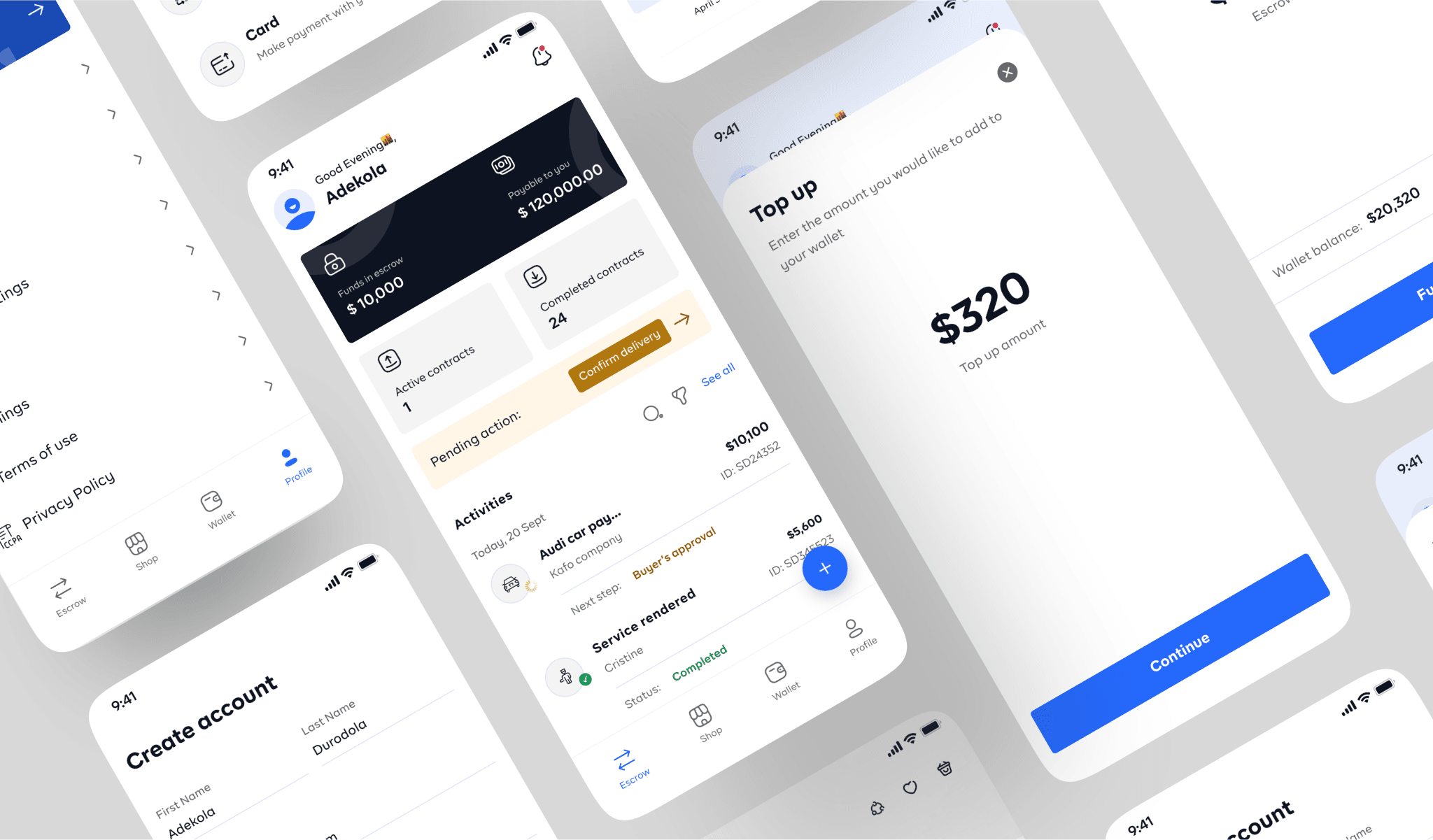
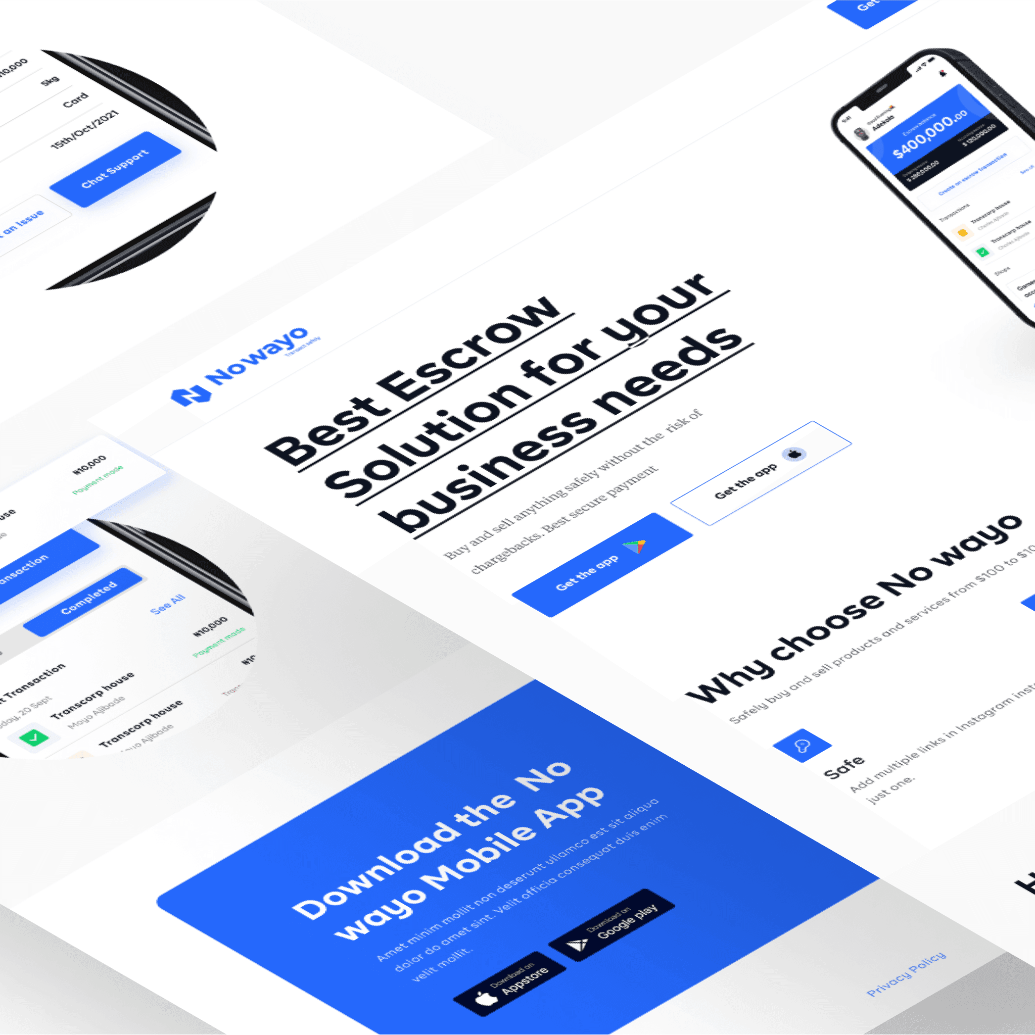
Below are other designs in the app like the Landing page and other mobile pages that wasn’t fully discussed but help make the product usable for the users.
CONCLUSION
Learning & Take aways
The goal of the product is to make transaction be conducted with trust between parties that are involved while providing security for the funds and parties involved.
I had the opportunity to work closely and collaborate with the engineering, product management, and QA teams throughout this project. Adhering to the initially proposed milestone planning was crucial, significantly aiding us in time management and successful project delivery.
My active participation in stand-ups, sprint reviews, and implementation demos played a pivotal role in rectifying situations where design implementation by both the design & engineering team required adjustments.
Key metrics
