DISCOVERY & RESEARCH
Background
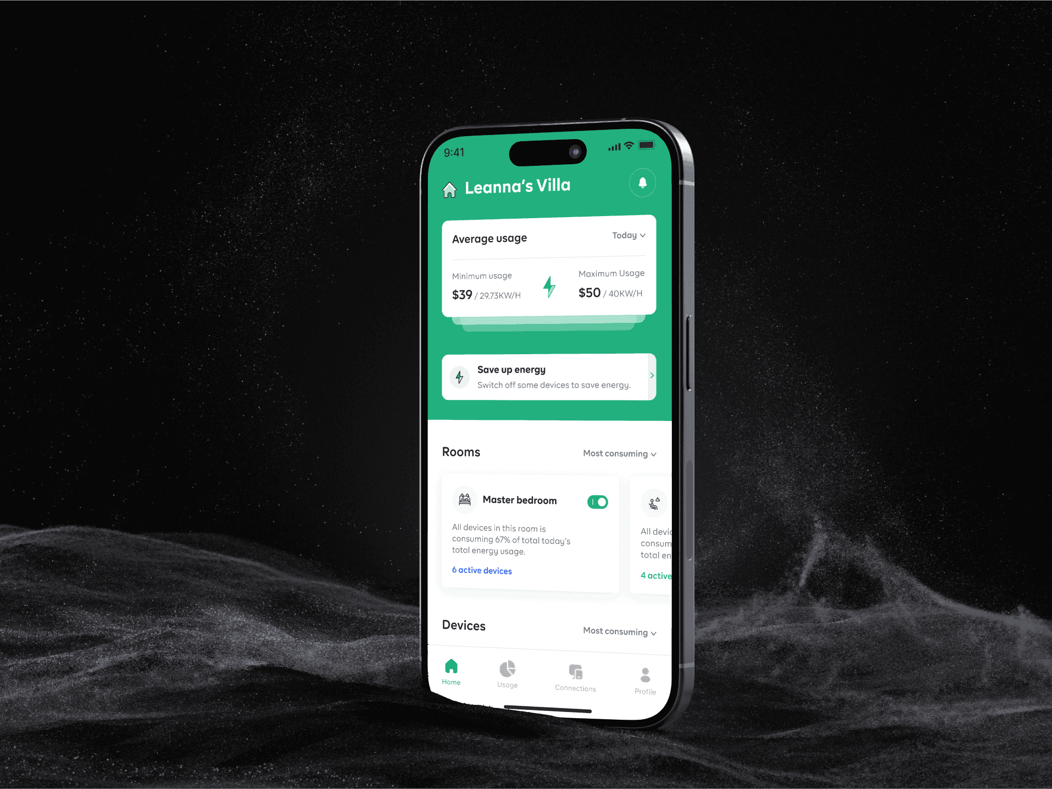
Savme is an innovative energy management tool designed to empower households to take control of their energy consumption. By providing detailed breakdowns of energy usage by appliance, Savme enables users to track and reduce their energy costs effectively. Savme’s user-friendly platform offers actionable insights, making energy saving and environmental responsibility easier than ever. Beyond financial savings, Savme empowers users to take measurable steps toward lowering their carbon footprint, integrating sustainability into their everyday lives. Savme represents the next generation of energy management, combining technology and environmental consciousness for a smarter, greener future.
Understanding the problem
As energy consumption becomes a critical concern for both cost and environmental reasons, users need effective tools to monitor their usage and spending. However, existing products on the market often fall short, offering limited tracking capabilities and presenting challenges in user experience and interface design.
Solution alignment
SavMe simplifies energy management by offering an intuitive, user-centered platform that makes tracking energy usage and costs straightforward. By addressing the limitations of existing tools, SavMe provides users with clear, actionable insights, helping them make smarter decisions about their energy consumption and contributing to a more sustainable lifestyle.
Product goals
- Empower users to track and optimize energy usage
- Enhance user experience with an intuitive interface
- Enhance Environmental Impact Awareness:
- Foster Sustainable Living
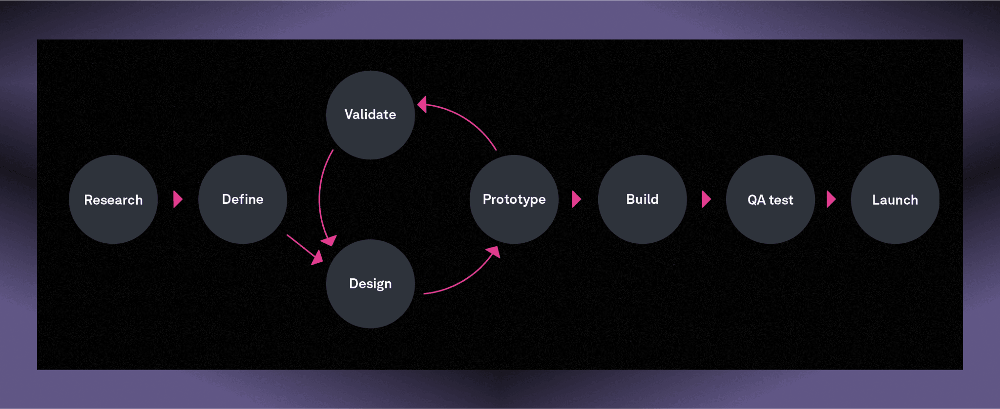
Design process
Research time
I began by engaging in detailed discussions with stakeholders to understand their vision and objectives for the product. These conversations were crucial in aligning the goals of SavMe with the needs of its target audience..
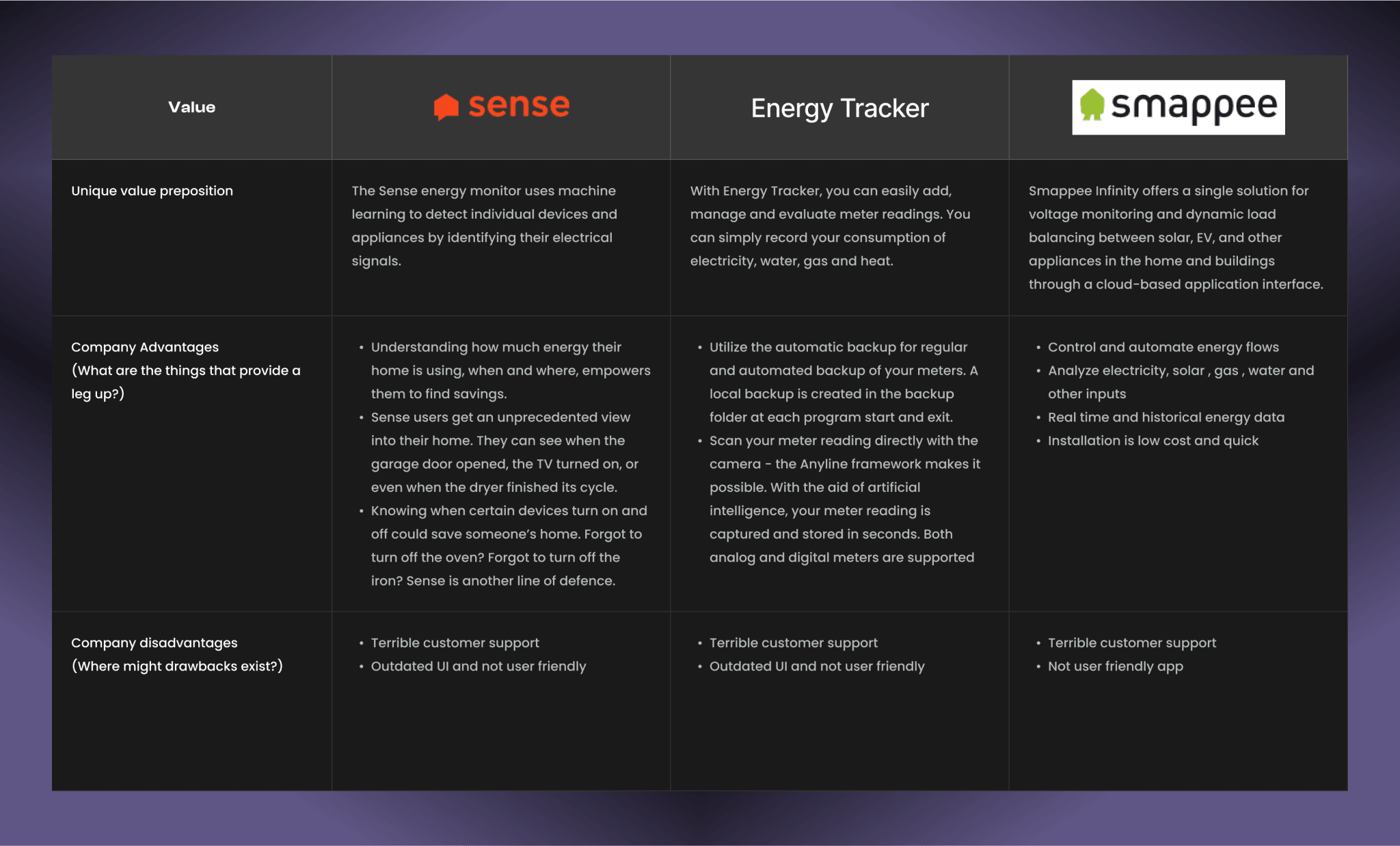
After understanding the core objectives, I conducted a thorough competitor analysis using the SWOT method. This involved identifying strengths, weaknesses, opportunities, and threats of existing energy consumption trackers in the market. Through this analysis, I gained insights into the features and functionalities that were well-received by users, as well as areas where competitors fell short. This helped in identifying gaps in the market and opportunities for SavMe to offer unique value propositions, such as a more intuitive interface or a stronger emphasis on environmental impact.
Brainstorming sessions with the design team were another key aspect of the research process. These collaborative discussions allowed us to generate innovative ideas for features and user flows that would address the needs identified during user interviews. We explored various design concepts, such as visualizing energy usage in a user-friendly way and providing tips for reducing consumption.
Competitor’s Analysis
The competitor analysis was aimed at providing strategic insights into the features, functions, flows, and feelings evoked by the solutions of the competitors.
User Persona
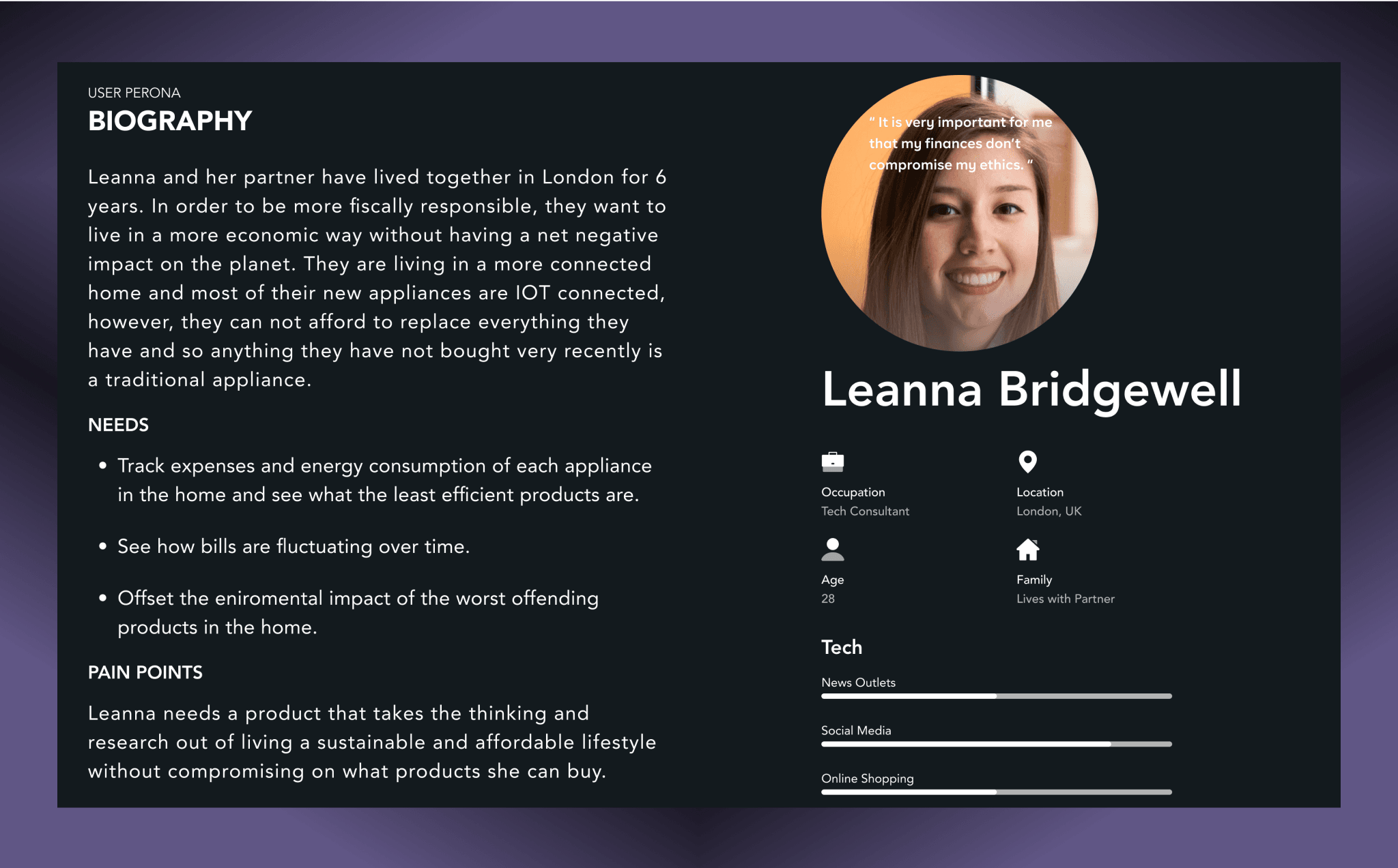
To create a user-centered product that effectively meets the needs and addresses the pain points this user persona was created.
Insights
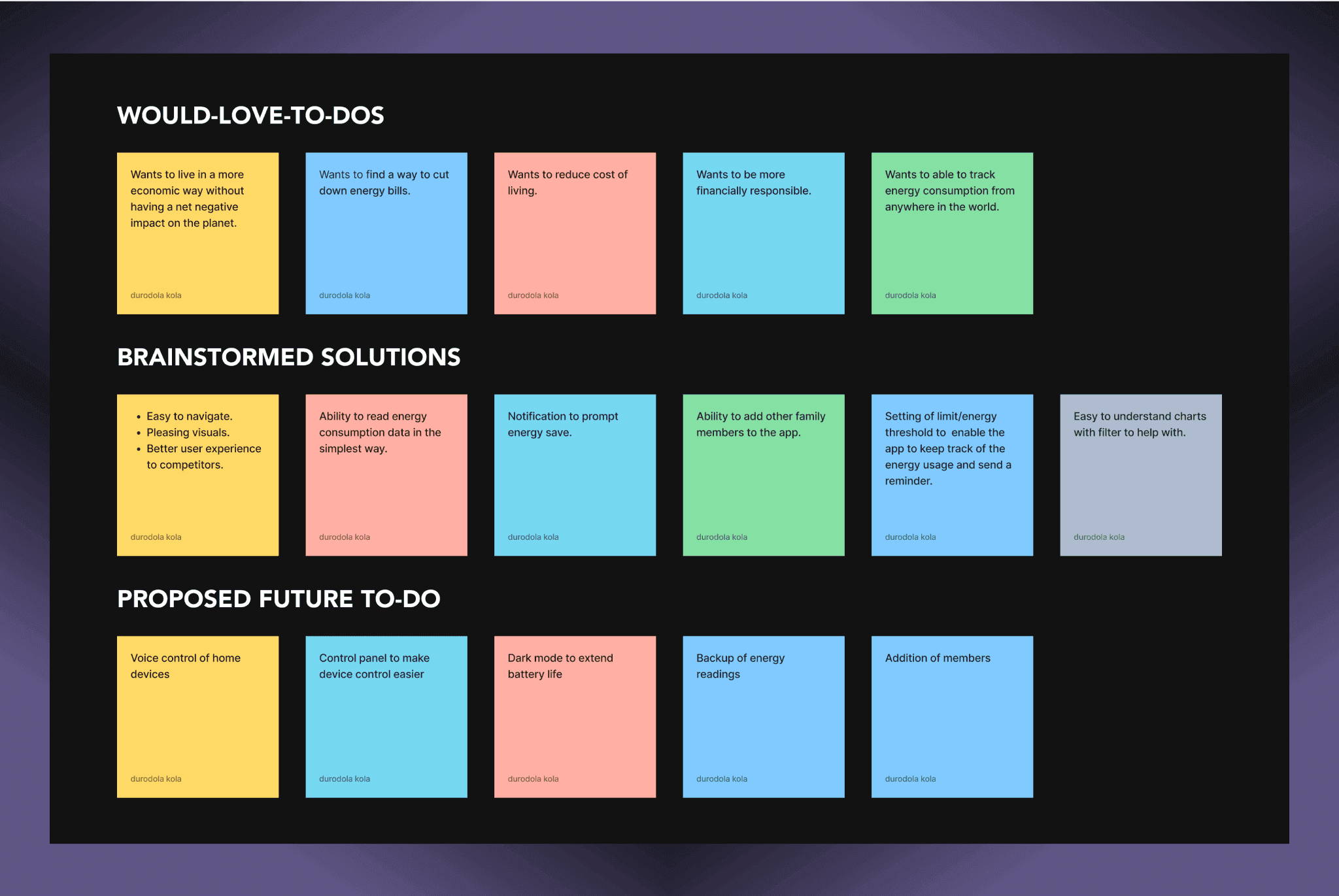
Following the quantitative and qualitative research conducted, which includes merchants, sellers, ecommerce solutions, buyers and some brainstorming and assessing existing solutions. As a result, we created this insight board based on those data. It helped us get a better understanding of the users, what they would love to do, how might we help them and brainstorm solutions to build a product that solves their problem (s) and also future to-dos.
STRUCTURE
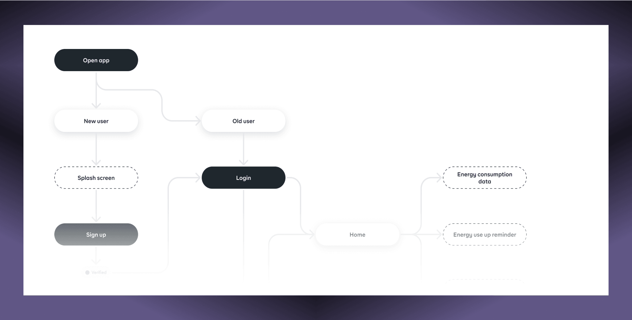
User flow
Gathered information on the goal by using the user persona, understanding the user’s role, typical activities, and wants.Using this information, I was able to analyze the tasks and flow users need to complete getting an escrow done.
CONSISTENCY IS UNIQUE
Style Guide & Components
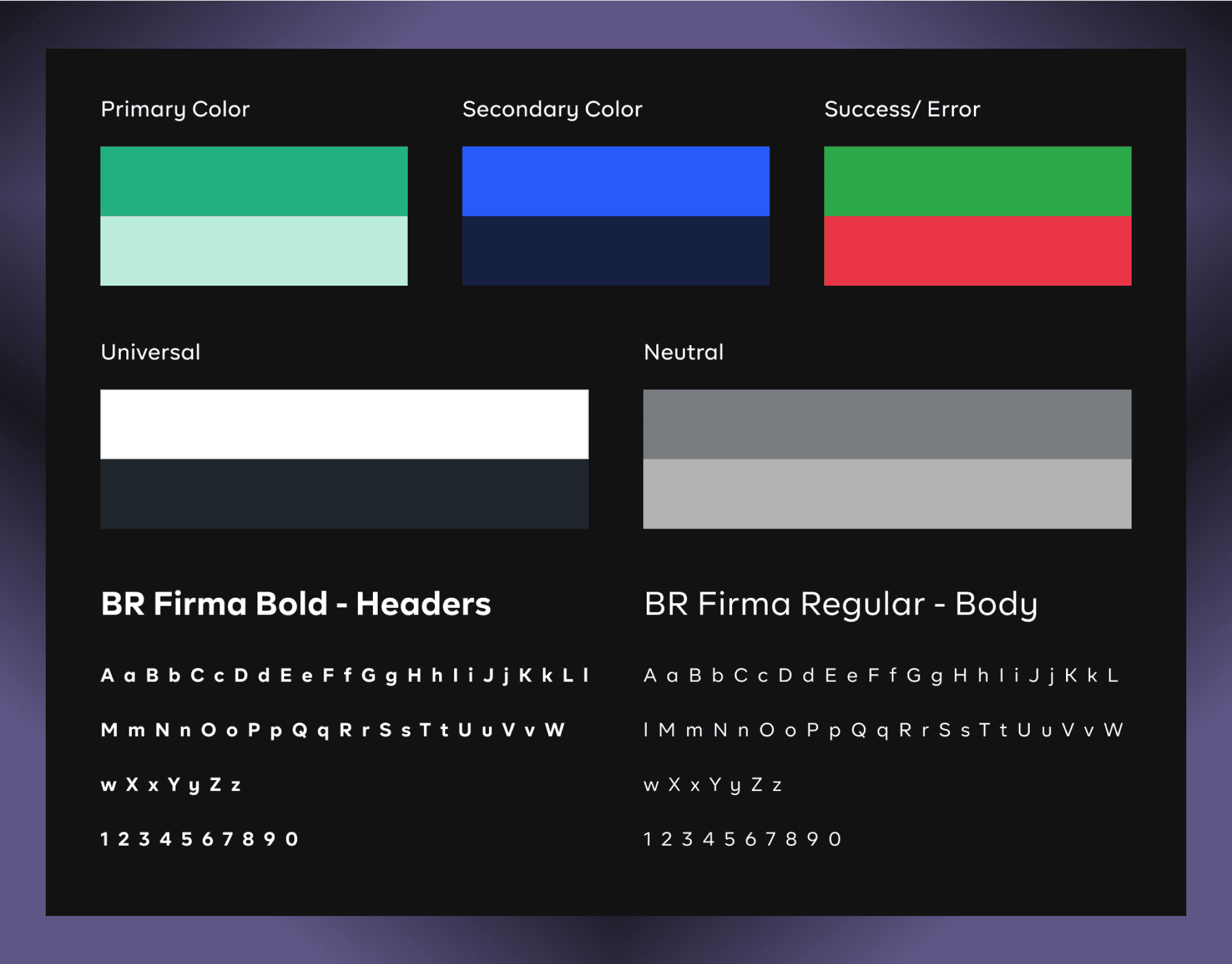
To maintain design consistency across the SavMe product, I created a detailed style guide along with a set of visual components. This initiative significantly streamlined my workflow, boosting productivity by tenfold. The style guide and components I developed encompassed elements such as buttons, color palettes, input fields, shadows, icons, notifications (toasts), tooltips, selection controls (checkboxes, radio buttons, and toggles), dropdowns, navigation elements, tags, and labels.
DESIGN DECISIONS
Ideation
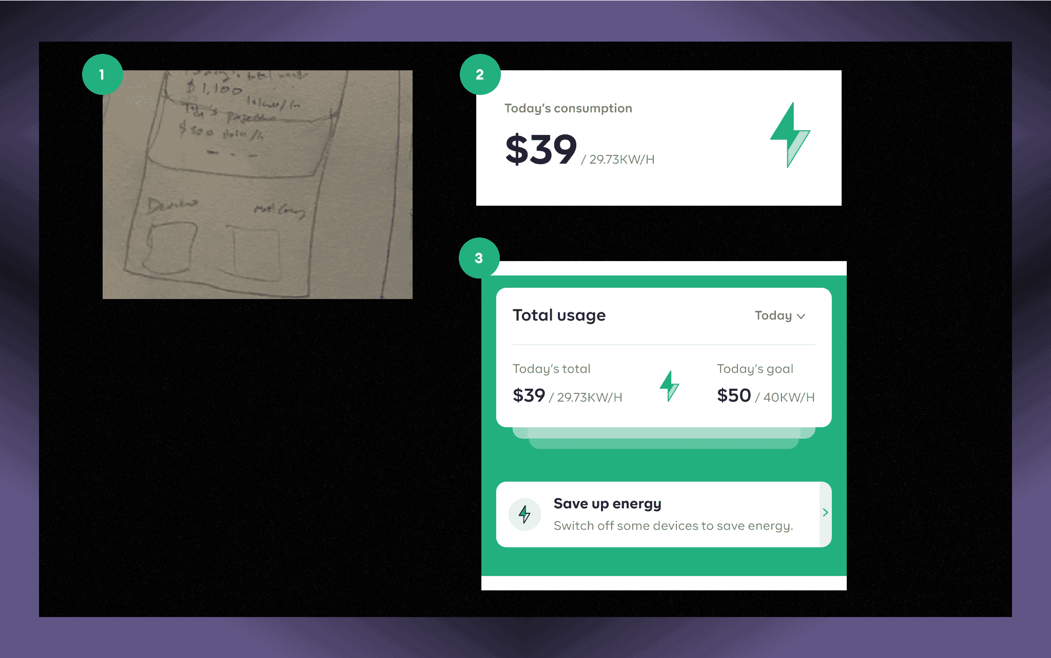
- An alert component is a good approach, using the color contrast to draw attention to the component without being intrusive and a UX copy showing how energy usage can be saved in real time.
- I explored adding just the day’s consumption in money to killowatts alone. The drawback to this is the day’s goal of energy usage will not be displayed. Also, this iteration only shows the devices and not the room energy usage.
- I explored a third approach which clearly visualize the energy usage for the day and what the day’s goal is and users can also drill down on the usage daily, weekly or monthly.
USABILITY HEURISTICS: Visibility of system status
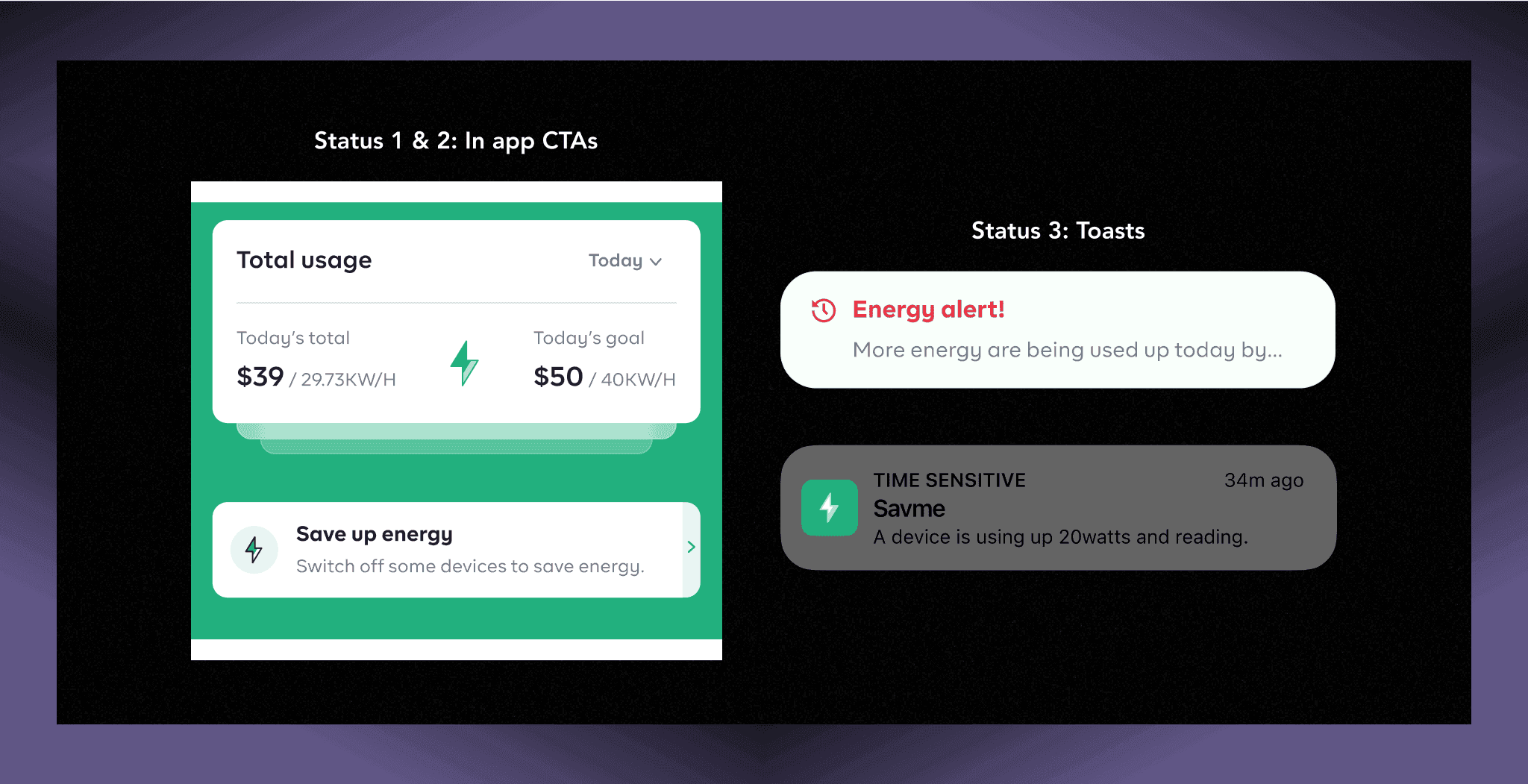
The design should always keep users informed about what is going on, through appropriate feedback within a reasonable amount of time;
- Used cards, and microcopy to clearly indicate progress of energy usage of the day and break the process into three stages, also users can quickly slide to see their usage today/average usage and usage till date.
- Use CTAs to inform users of the latest action they can take on the app, users experience higher satisfaction when they get notified and can take quick actions to help them with their energy usage.
- The system should communicate to the user what’s going on using toasts and inform them about the current state of their energy usage.
Onboarding
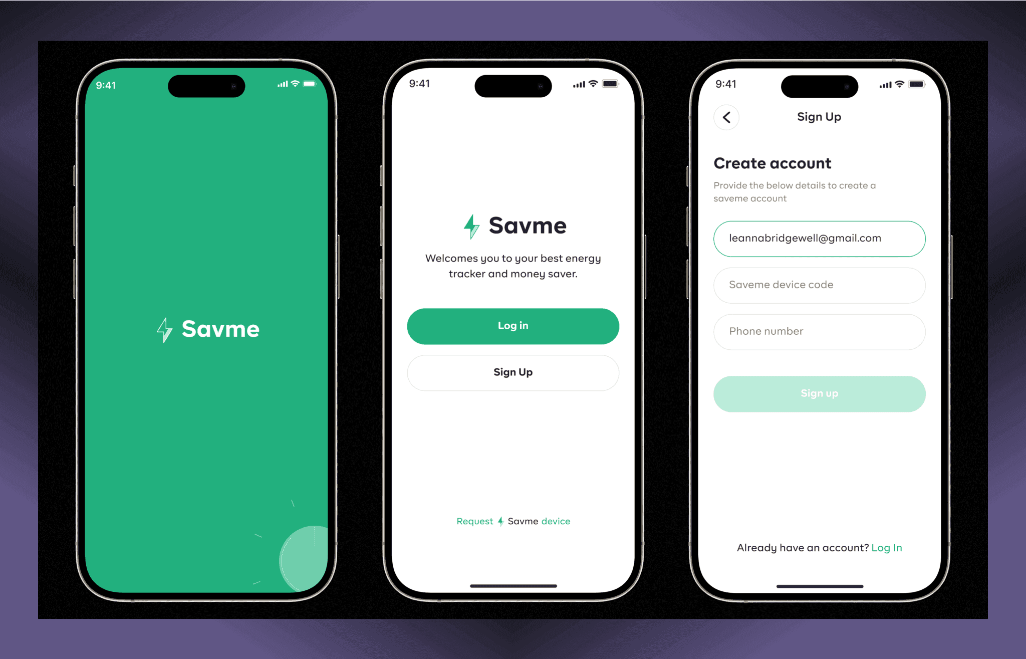
Designing the onboarding pages for the SavMe app was a process that focused on ensuring a smooth and intuitive user experience while clearly communicating the essential steps required to use the app. The onboarding journey was crafted to guide users through the necessary actions in a way that feels seamless and engaging.
Home
Designing the home page for the SavMe app was focused on creating a user-centric interface that provides clear and actionable insights into energy consumption. The home page was structured to offer 3 snapshot cards of the user’s energy usage, starting with a prominent display of the current day’s total consumption compared to the user’s set goal. This helps users immediately understand their energy expenditure at a glance. They can switch to look at their average and total’s energy usage.
An alert section was also added to help the users stay afloat what’s happening with their energy usage and make informed decision regarding the usage. As well as managing the devices in rooms, filtering the room and devices section down to what’s important to them to make these informed decisions.
Overall, the design prioritizes ease of use while providing comprehensive energy tracking, helping users make informed decisions to optimize their energy consumption.

Connection Management
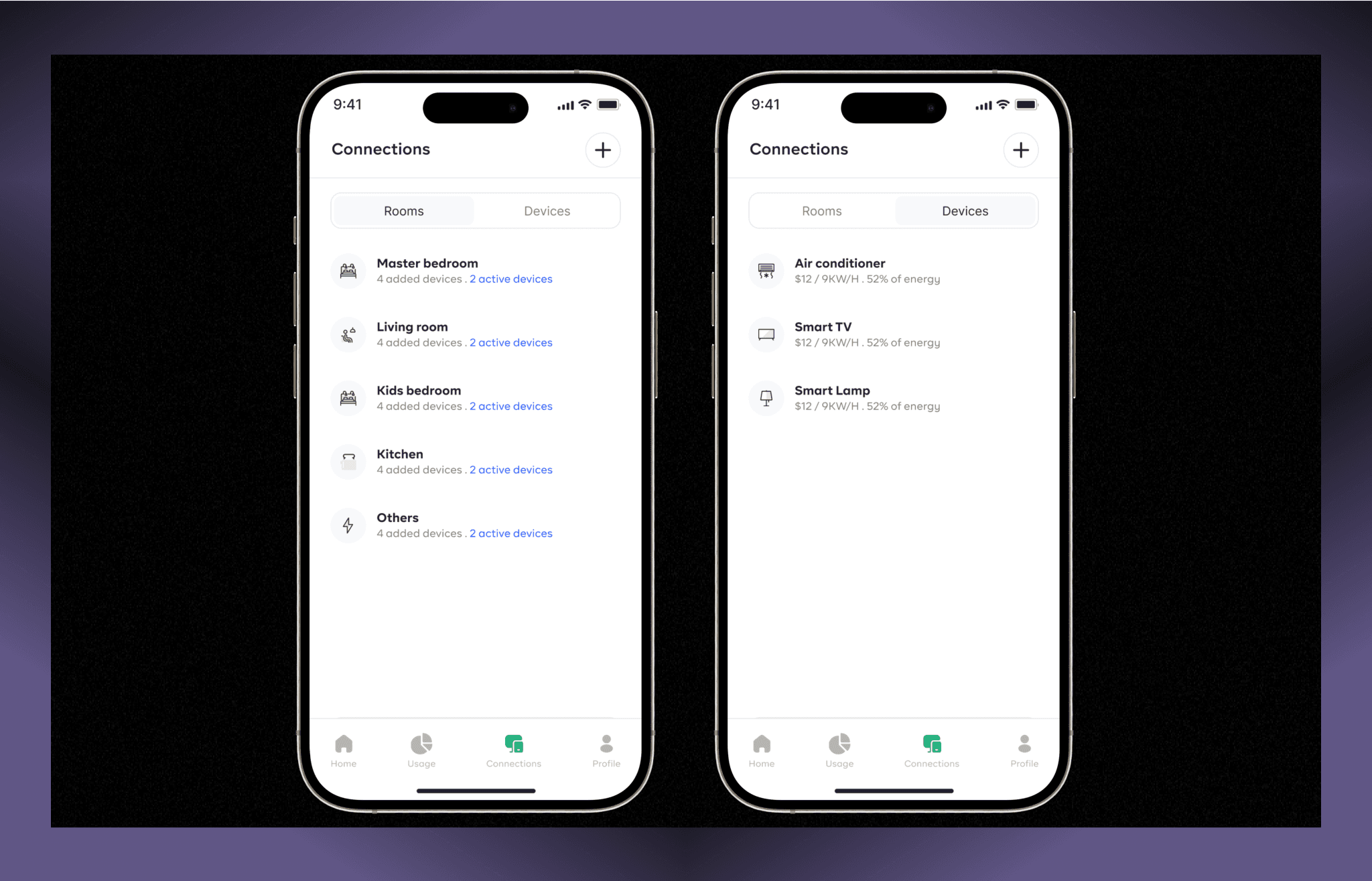
The connection management was designed to help the users find the devices and rooms they’ve added on the app and manage these components. Users can also add a new device or a room to the app, and allocating a device to a room for proper management. This is where the user add a device or add a room and add a device to a room. It also shows the list of devices/rooms , the status and the amount of energy used by the day.
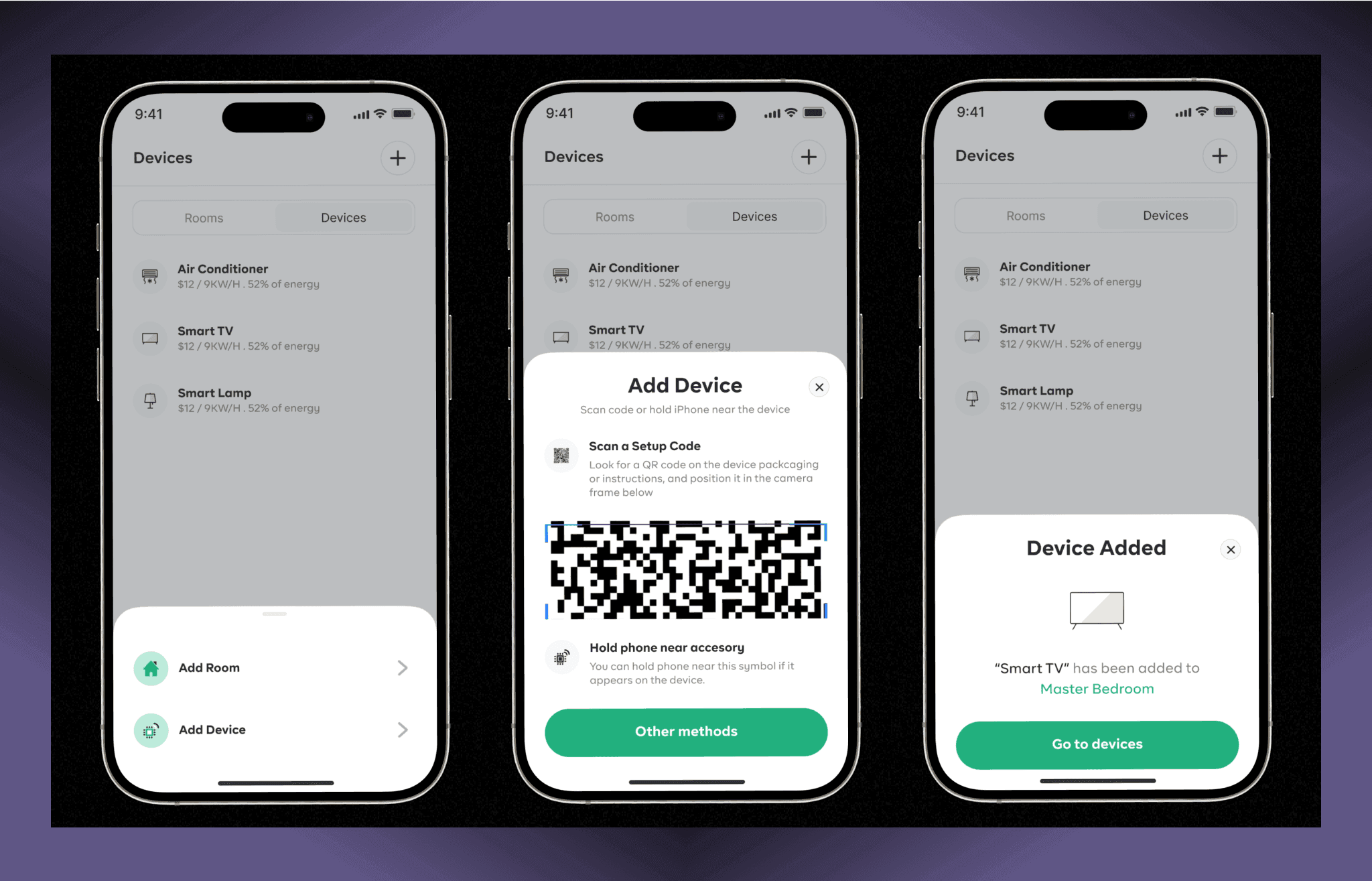
Adding a room & devices
Adding of a room or a device helps the users know which device/room is using more energy and helps users have proper overview of where exactly to look in the case of any action they want to perform.
Device details
This shows the device details by room or by individual device. Also, the users can filter device check based on the setup when adding a device.
I also show the breakdown of energy consumption by the room or device with dates with actions as how IOT devices also work.

Usage
The interface should not contain information which is irrelevant or rarely needed. Every extra unit of information in an interface competes with the relevant units of information and diminishes their relative visibility.
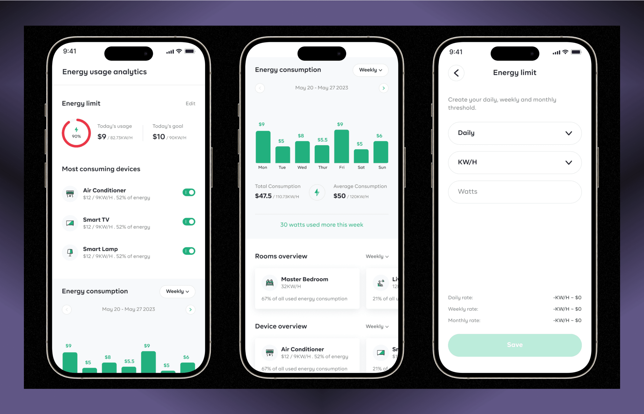
Using the insight cards from the research, I am able to design this page with only relevant information that the users find useful pertaining to their energy usage activities, and they can filter the information down to daily, weekly and monthly.
Also, the users can set their energy usage limit per day/weekly/monthly. This way they get alerts if they’re using more up to or more than in a day.
This page shows the overall energy usage/ consumption in the house, giving breakdown of each and every room, every devices, day – to – day , week – to – week, month – to – month. This is also where the user get to create their energy limit (threshold) to help minimize and keep watch on how much energy is been used per day.
Other screens
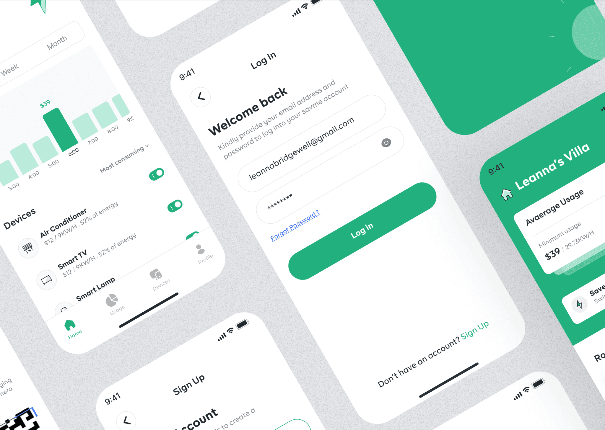
Below are other designs in the app like the Landing page and other mobile pages that wasn’t fully discussed but help make the product usable for the users.
CONCLUSION
Learning & Take aways
As the product designer for the SavMe app, the design journey was a blend of challenges and insightful discoveries. One of the key learnings was the importance of balancing simplicity with functionality. It became clear that users need immediate, actionable insights without being overwhelmed by data. This understanding drove the decision to create a clean, intuitive interface that prioritizes the most relevant information, such as daily energy usage and room-specific consumption.
Another significant takeaway was the value of user-centered design in creating a seamless onboarding experience. By focusing on guiding users step-by-step—from requesting the SavMe device to setting up and tracking their energy consumption—user adoption was enhanced. This process highlighted the need for clear communication and reassurance, especially when dealing with technology that directly impacts users’ daily lives and finances.
Key metrics
